Menu
Work
Home
Studio
Ovrtime
Info
←
Are you ready to start a project?
Let's Talk!
→
More Projects
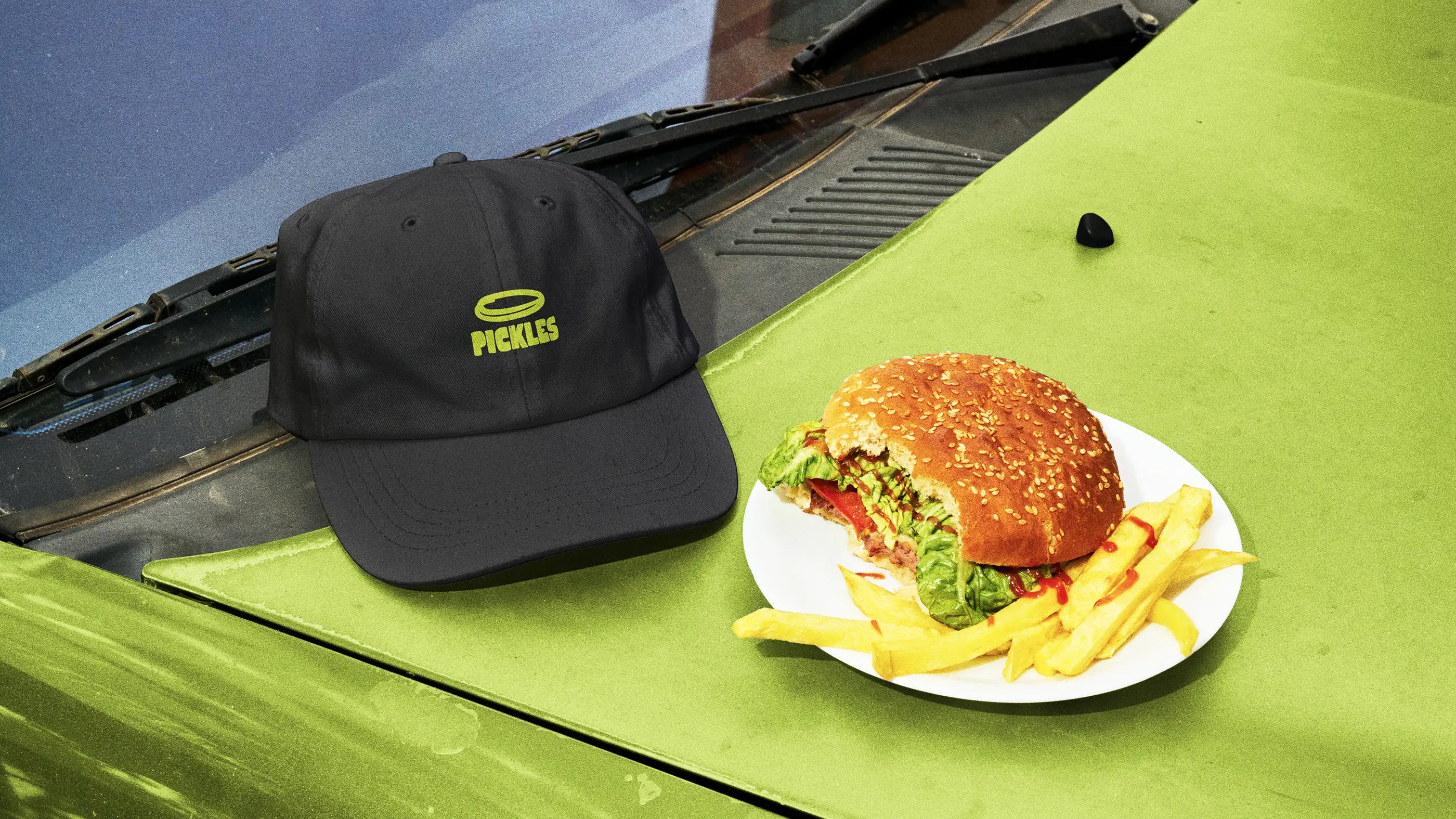
Pickles Toast House
Wrkday Studio
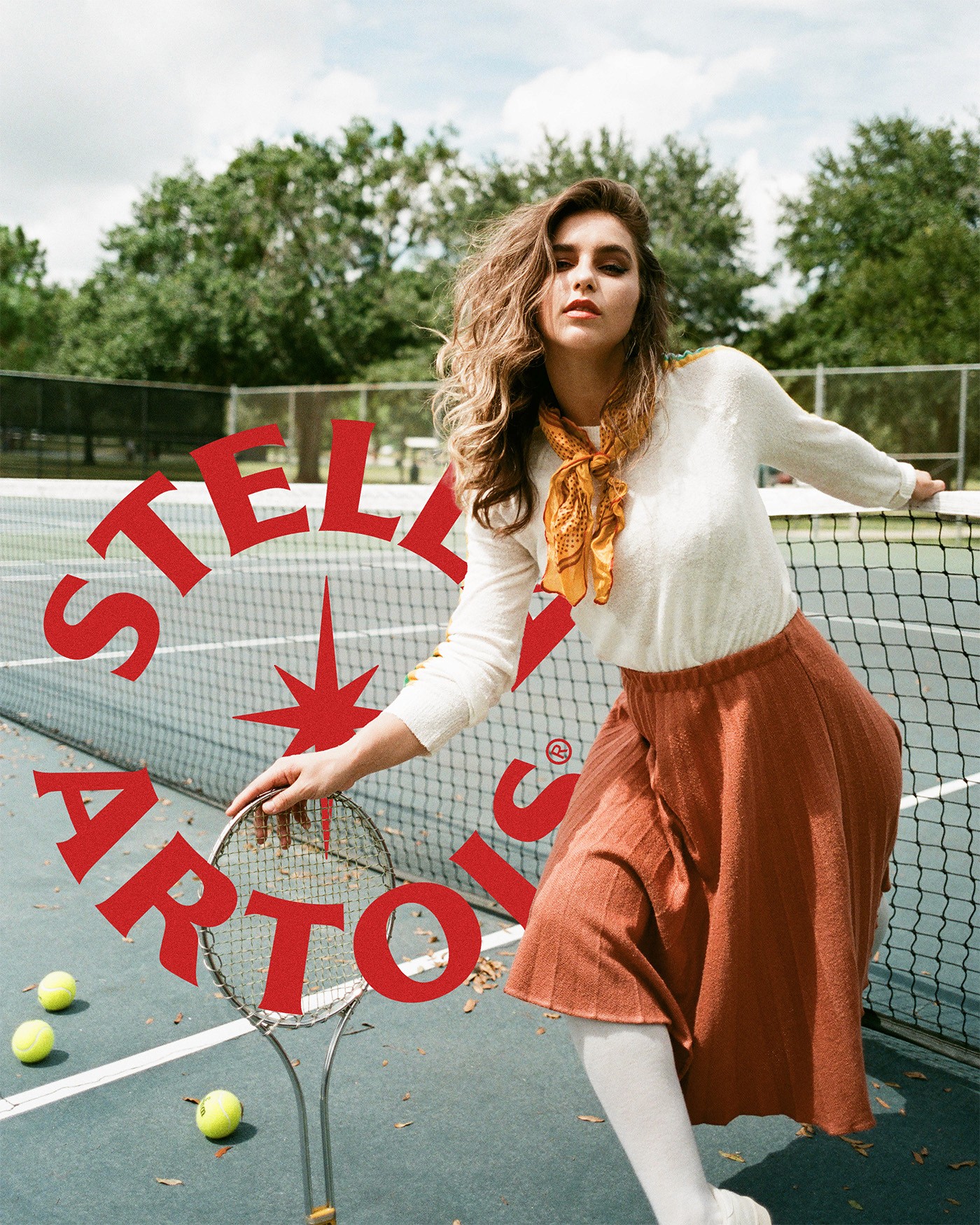
Stella Artois